- September defies its weak reputation as the S&P 500 shows remarkable strength.
- A surge in outperforming stocks highlights robust market breadth, the highest since 2002.
- Below, we discuss five key charts that reveal strong momentum for the S&P 500 as 2024 enters its last quarter.
September has a reputation for being one of the worst-performing months. This year, however, has defied expectations with the S&P 500 set to deliver exceptional September performance.
The surge in outperforming stocks, reaching levels not seen since 2002, underscores the strength of the market.
With various bullish signals emerging, let’s analyze five critical charts depicting the S&P 500’s unprecedented performance this year and its potential to maintain momentum through the remainder of 2024.
Chart 1: Records Continue – S&P 500 Hits New All-Time Highs
The S&P 500 recently marked three new all-time highs in a single week, bringing the total to an impressive 42 for 2024.
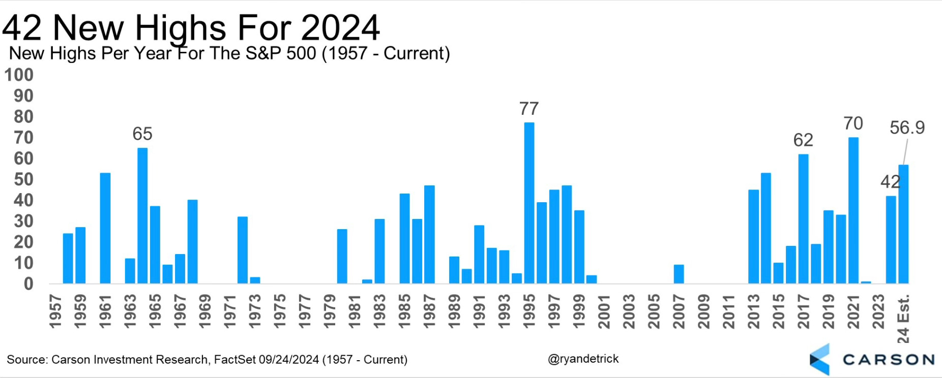
This chart visually portrays the frequency of all-time highs for the S&P 500, showcasing its stellar performance against historical September trends.
Chart 2: Resilience Demonstrated – Consistent Positive Weeks
Over the past year, the index has shown remarkable resilience, with 35 out of 52 weeks delivering positive returns, reflecting robust market momentum.
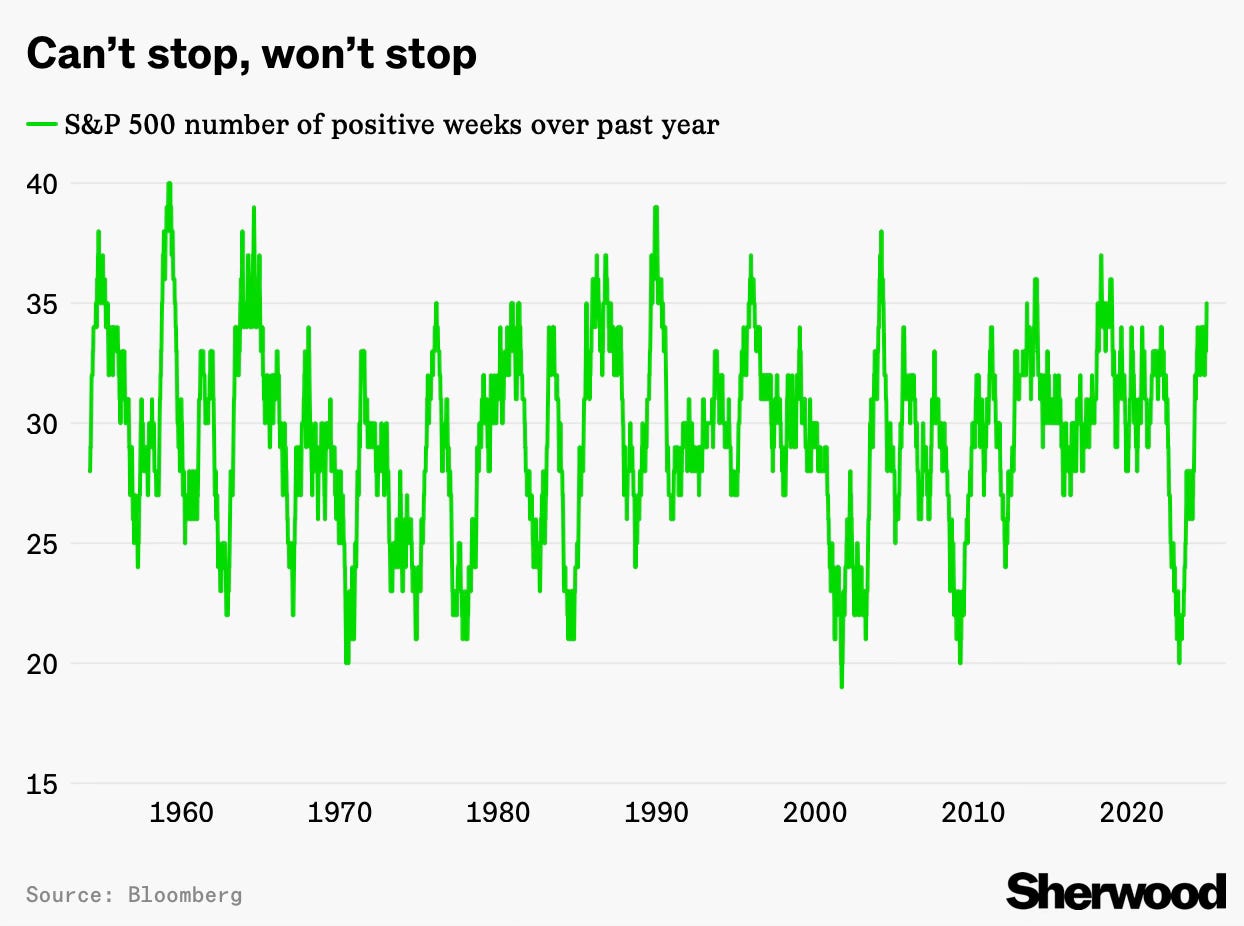
Chart 3: Market Breadth Strength – Outperformance Trend
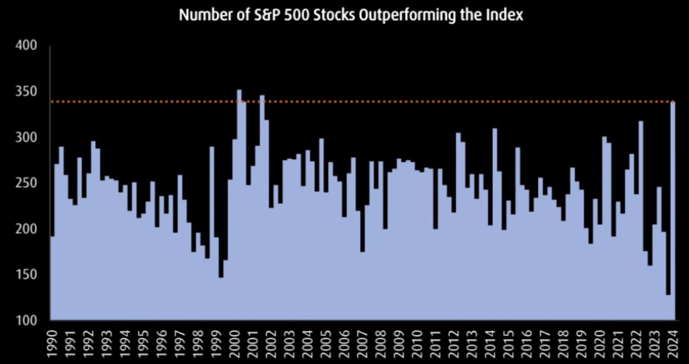
This chart demonstrates the proportion of stocks outperforming the S&P 500, signaling robust market breadth seen at levels last witnessed in 2002.
Chart 4: Inflation Trends Monitored – Disinflation Continues
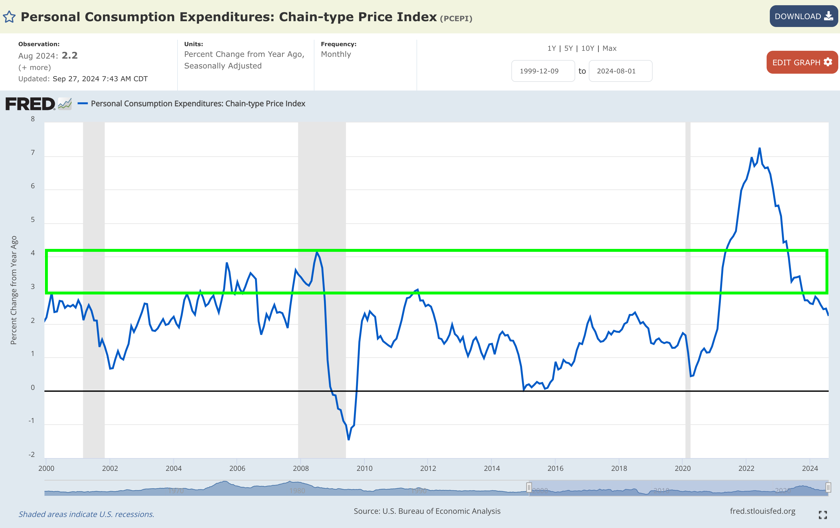
This chart tracks the year-on-year disinflation rate, indicating a slight decline from +2.45% to +2.23%, affirming the persistence of the disinflationary pattern.
Chart 5: Employment Landscape Explored – Labor Market Trends
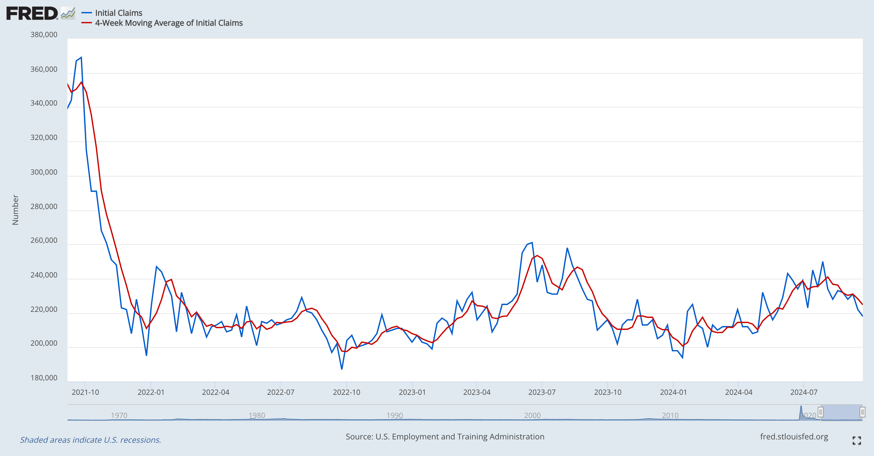
This visual representation tracks the labor market’s dynamics dating back to September 2021, indicating a swift decline followed by nearly three years of sideways movement, quelling concerns of substantial deterioration.
Key Takeaway
As we delve into this data, it’s evident that the current bullish trend is robust and unprecedented in its strength.
This juncture offers a chance for reflection on the sources guiding your market perspectives in recent times.
If you’ve held a bearish view and refrained from participation, reassess the voices shaping your outlook on the market today.
If certain narratives have consistently led you astray with failed predictions, ponder why those voices still command your attention.
***
Disclaimer: This article offers insights for informational purposes only. It does not advocate asset acquisition or serve as a solicitation, offer, recommendation, or investment suggestion. Remember that all investments carry risks and should be evaluated carefully. Any investment decisions made are at the investor’s sole discretion. No investment advisory services are provided.
